Lending a helping hand

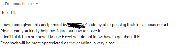
On a regular day, I am always on the look out for the next Tech-related training session I can share with my whatsapp contacts so they can pick up a Tech skill. On one of such days, I posted a Data Science training by a particular organization(name withheld) and a friend of mine signed up. As part of the selection process, they were given a task to complete. So he sent me the mail below.
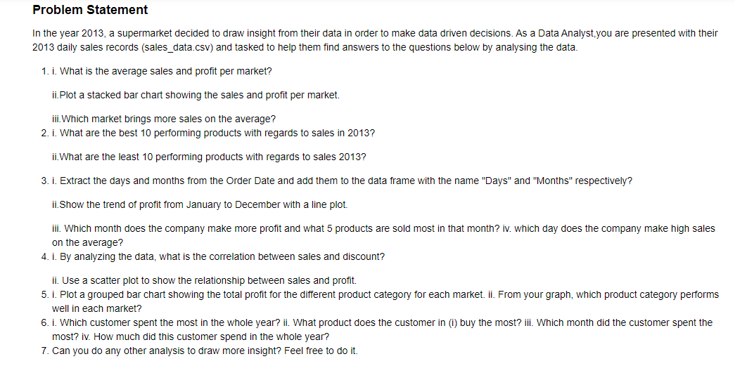
I was very excited about the opportunity to help someone out. He must have really believed in my data science skills to have sent that mail. So I set out to look at the assignment and it was a full blown Data Science project. It got me wondering why novices will be given such an assignment. I started working on it anyway but I needed some help so I reached out to John Eshun. I met John at my just ended data science boot camp by the way. The next day, my friend texted to say that the assignment had been called off and the entire recruitment process restarted because they received some feedback about the said assignment. Was I sad about hearing this? Yes, because I sacrificed time I needed for my ENT exams(1 day away) to work on it. Can I make something great out of it? Yes, it was a great learning opportunity for both John and I so I can share it with others to learn too. The project tells the story of a supermarket that decided to draw insight from their data in order to make data driven decisions in 2013.Let's have a look at it,
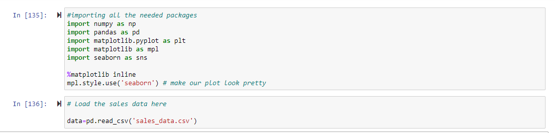
So the first part is to import all the packages needed to complete the task and read the sales data
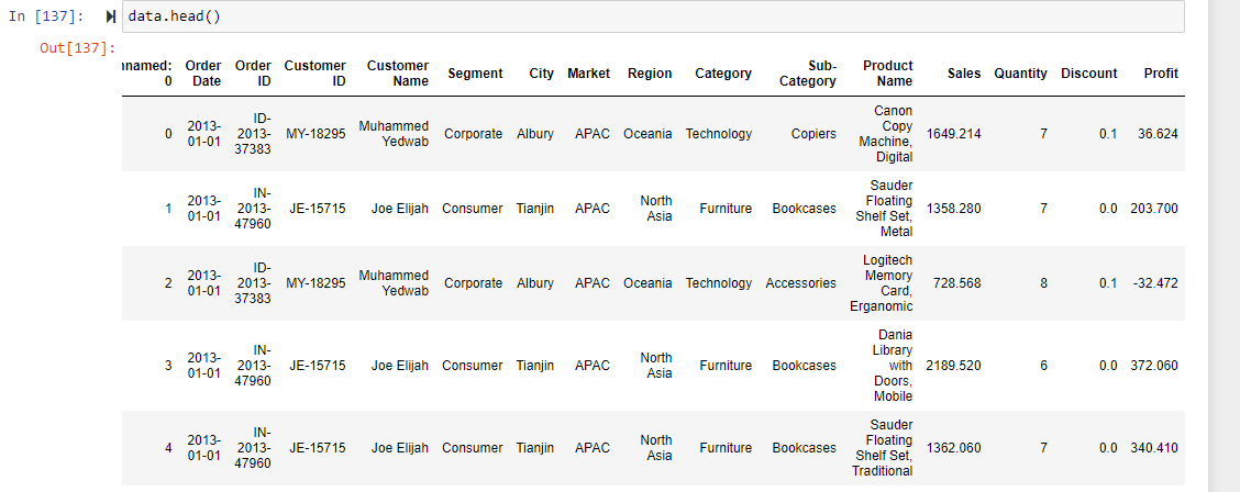
 The first 4 rows of the data looks like this(There are 13,799 entries in all by the way. That's a lot of data),
 Now let's answer the questions
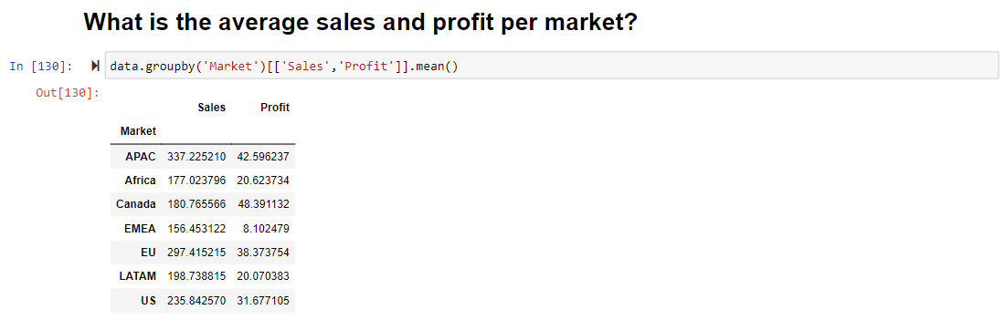 From the data set, there are 7 different markets and you can see that averagely APAC makes the most sales but Canada makes the most profit. The .groupby() function allows us to group records into buckets by categorical values, such as market, sales, and profit in this dataset.
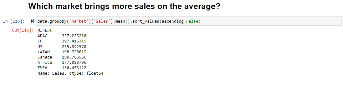
You realize that you had to literally look through the list to see which market had the highest sales. It was pretty easy for you because there are only 7 markets. But what if there were more? Like 100 markets? You definitely won't have the luxury of time to look through. But what if we could write a simple line of code to rank the sales and see the highest as the first on the list? There you go. Life made pretty easy. We see APAC as the first.
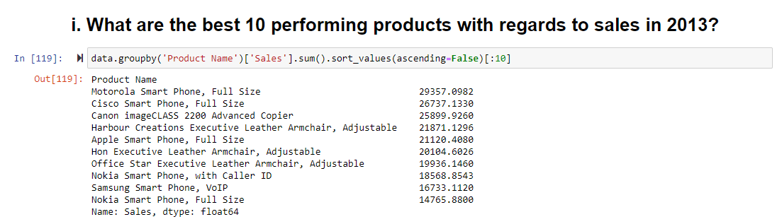
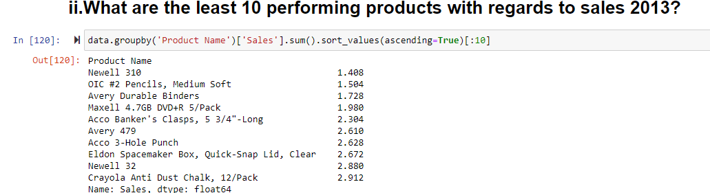
Next, we can see the top 10 best and least performing products.
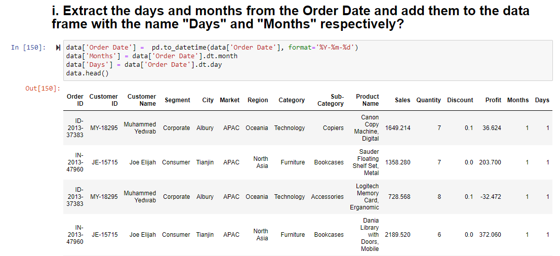
 For the next set of questions, we needed to extract the day and month from the Order Date in the data set.
So first we had to import a package called DateTime. It’s a really powerful way of handling anything date and time related in Python. Next we convert the Order Date to a datetime object to be able to extract the day and month and add them as columns to the data set.(Can you see the difference in the data sets now? I bet you can)
For the next set of questions, we needed to extract the day and month from the Order Date in the data set.
So first we had to import a package called DateTime. It’s a really powerful way of handling anything date and time related in Python. Next we convert the Order Date to a datetime object to be able to extract the day and month and add them as columns to the data set.(Can you see the difference in the data sets now? I bet you can)
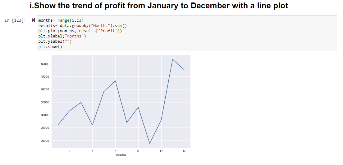
From the line plot showing the trend of profit from January to December, you can see that the company makes the most profit in the 11th month(November) and the least profit in the 9th month(September).
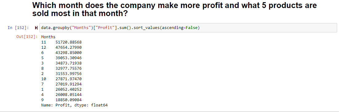
 But what if you need to know the exact amount of profit made each month as well as rank the months in descending order of profit? You just need a single line of code. Voila! We still see November at the top and September at the bottom. Confirming that indeed November is the most profitable month.
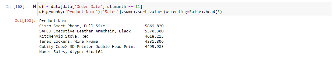
 Since you know that November is the most profitable month, its pretty easy to find what 5 products are sold most in that month.
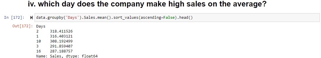
 You can also see that the company makes the highest average sales on the 2nd day of the month.
 Next we found the correlation between discount and sales. This will help influence many company decisions based on the outcome.
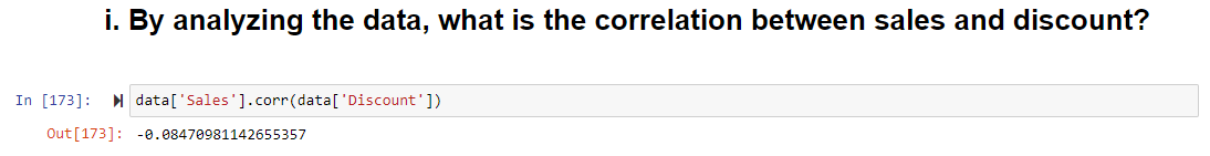 Since the correlation is -0.084710 it means there is a weak and inverse relationship between sales and discount. This means that as discount increases, sales decreases.
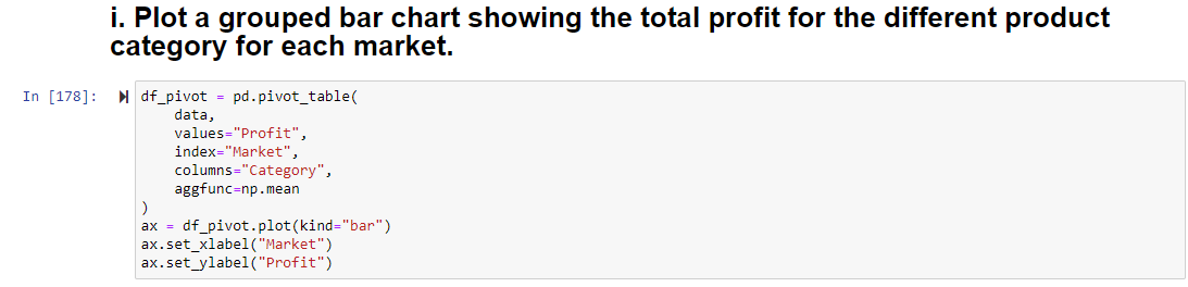
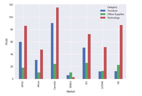
From the data set, it can observed that all the products have been divided into 3 categories (Technology, Furniture and Office Supplies).A grouped bar chart showing the total profit for the different product category for each market reveals that Technology performs the best in each of the markets except in EMEA where office supplies dominate.
 In the final part of the assignment, we found which customer spends the most the whole year, how much she spends, what product she spends the most on and which month she spends the most. Additionally, in our quest to involve various data analysts that read this article, we've left a part for you the data analyst to contribute to the project (Plot a stacked bar chart showing the sales and profit per market). Your task is to fork my repository, clone your fork, navigate to the file named "Sales Project", download it and work with it. You can find the data set here
From this simple assignment, you can clearly see how much insight a company can draw just by analyzing their data. This can influence policies that can drive the business to the next level. This is only one area we clearly see the power of Data Science. Like I always say, there is no limit to where a Data Scientist is needed, we're needed in virtually every sphere of life. You want to take a shot at Data Science? I think you should.


